

Table of Contents
Modern digital products are often judged by speed, novelty, or visual intensity. Yet the experiences that remain meaningful over time rarely rely on loudness. Instead, they are shaped through careful decisions, invisible systems, and a deep respect for the reader or user.
Design is not only about appearance. It is about intention — the invisible reasoning behind every spacing choice, interaction, and sentence structure. When design disappears, clarity begins to emerge.
Many creators eventually discover that the hardest part of building something is not adding features but deciding what should remain absent. Restraint becomes a creative tool.
Writing on the web is not only read — it is scanned, interpreted, and emotionally processed through layout.
This article explores how thoughtful structure transforms content into experience.
The Role of Structure in Digital Writing
Structure allows readers to navigate complexity without friction. Long-form writing especially depends on rhythm — alternating density and openness.
Paragraph length, spacing, and hierarchy all influence comprehension. A reader rarely notices these systems consciously, but they feel their effects immediately.
Hierarchy Creates Calm
Clear hierarchy gives the eye a place to rest. Headlines introduce direction, while paragraphs create momentum.
When hierarchy fails, readers experience subtle cognitive fatigue. They may not understand why an article feels difficult — only that it does.
Designers often underestimate how typography affects emotional response
Designing for Attention
Attention has become one of the rarest resources online. Interfaces compete constantly for it, often sacrificing depth for engagement. Thoughtful publishing takes the opposite approach. Instead of interruption, it invites immersion.
A well-designed article slows readers down without forcing them. White space becomes a silent collaborator.
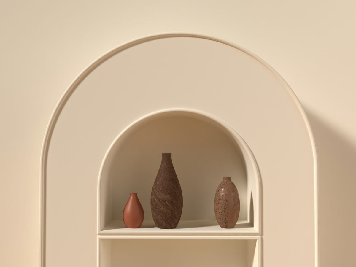
Seeing Through Images
Words alone cannot always communicate atmosphere. Visual references help translate abstract ideas into emotional understanding.
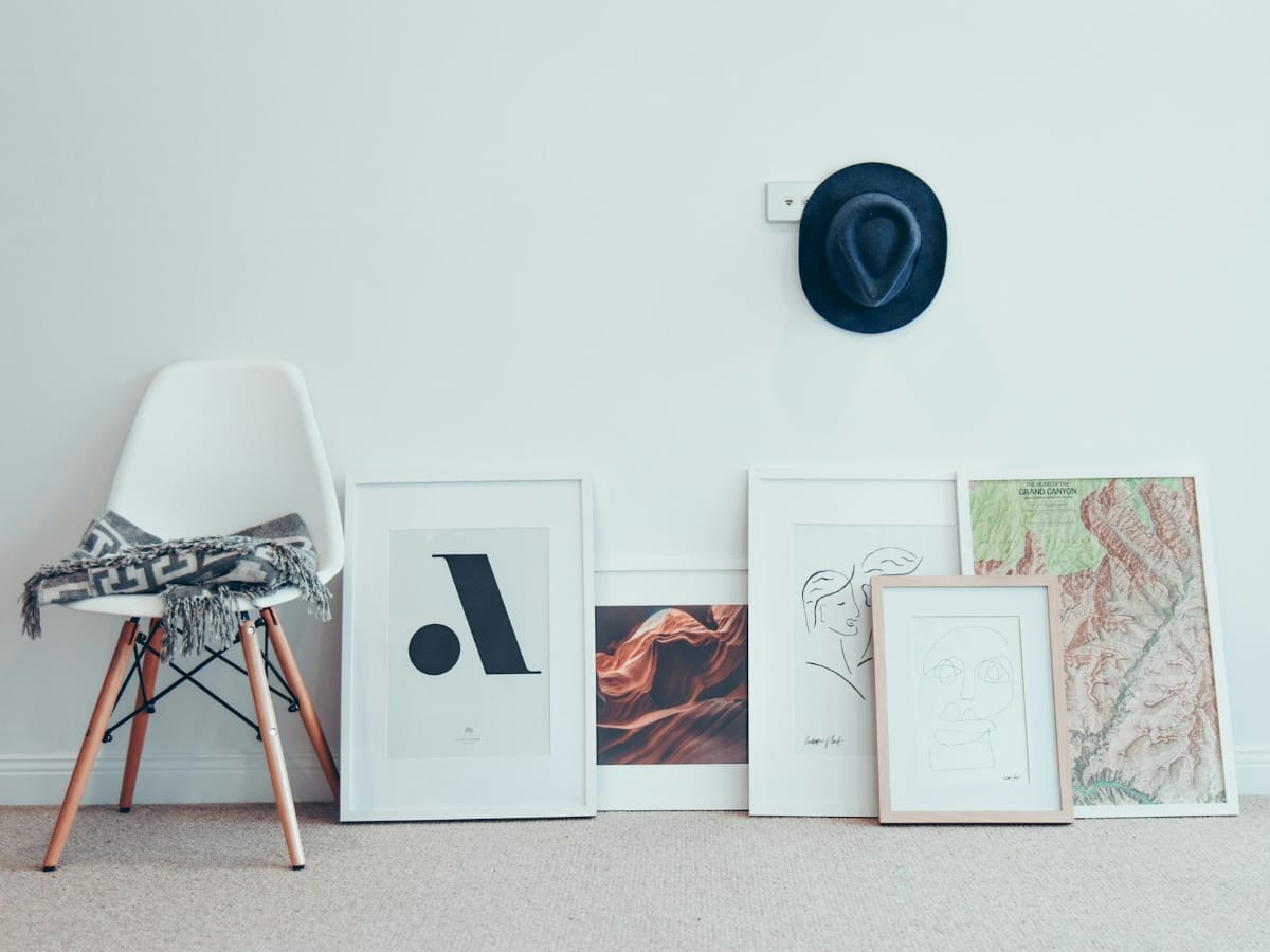 Photo by Christopher Burns on Unsplash


Gallery
Images should not interrupt reading. Instead, they extend the narrative — offering a moment of visual breathing space before the next idea begins.
Moments Worth Emphasizing
During long-form writing, certain ideas deserve gentle emphasis.
Small highlights help readers anchor key thoughts without breaking immersion.
Used carefully, emphasis becomes part of storytelling rather than decoration.
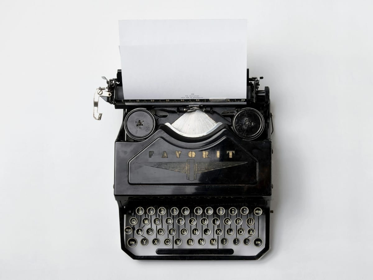
Tools That Stay Invisible
Technology should support thinking, not dominate it. The best tools disappear into workflow. Writers benefit from systems that reduce cognitive load — automatic organization, clear navigation, and predictable structure. Even simple scripts can transform how content behaves.
 1$('.top').click(function () {
 2  $('html, body').stop().animate({ scrollTop: 0 }, 'slow', 'swing');
 3});
 4$(window).scroll(function () {
 5  if ($(this).scrollTop() > $(window).height()) {
 6    $('.top').addClass("top-active");
 7  } else {
 8    $('.top').removeClass("top-active");
 9  };
10});
Small enhancements like this allow readers to shape their own experience without interrupting the article itself.
Watching the Creative Process
Sometimes ideas are easier to understand when observed rather than explained. Watching how a workspace evolves or how a designer approaches a problem reveals subtle decisions that words often miss. The creative process is rarely dramatic. It is slow, repetitive, and quietly focused — shaped by small adjustments made over time.
Minimalism is not the removal of personality — it is the removal of noise.
Notice how the environment remains calm and distraction-free. The tools fade into the background, allowing attention to remain on thinking rather than interaction.
Video, when used carefully, becomes an extension of storytelling — not an interruption of it.
Closing Thoughts
Digital publishing does not need to be overwhelming to feel modern. Calmness, clarity, and intention remain powerful design tools. A thoughtful article creates space — space to think, reflect, and return later. In the end, good design is not something readers see. It is something they feel while reading.


Start the conversation